nexus logo
Connection to Country
The Nexus Airlines logo represents our Kimberley origins and the connection to diverse regional destinations.
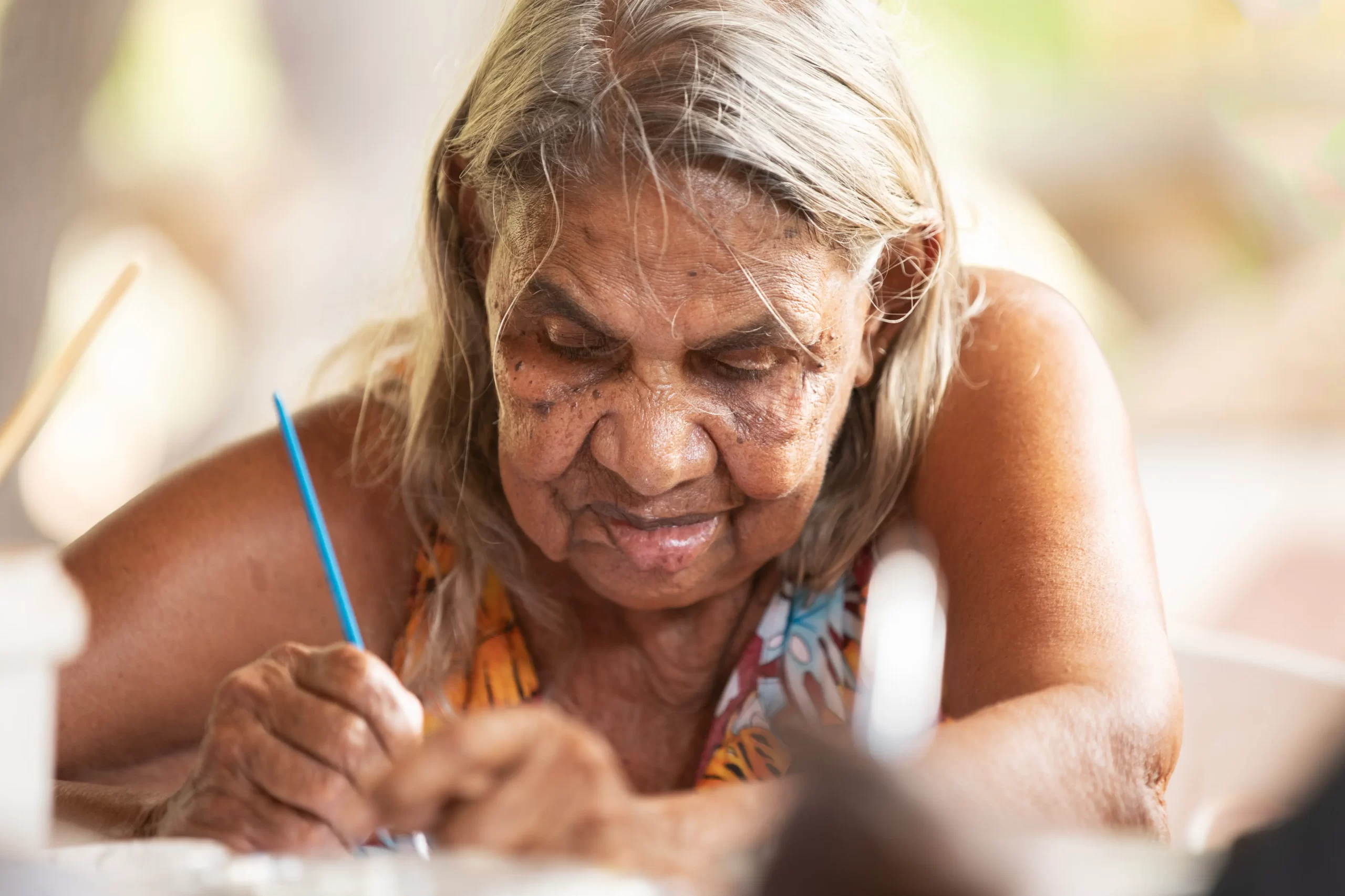
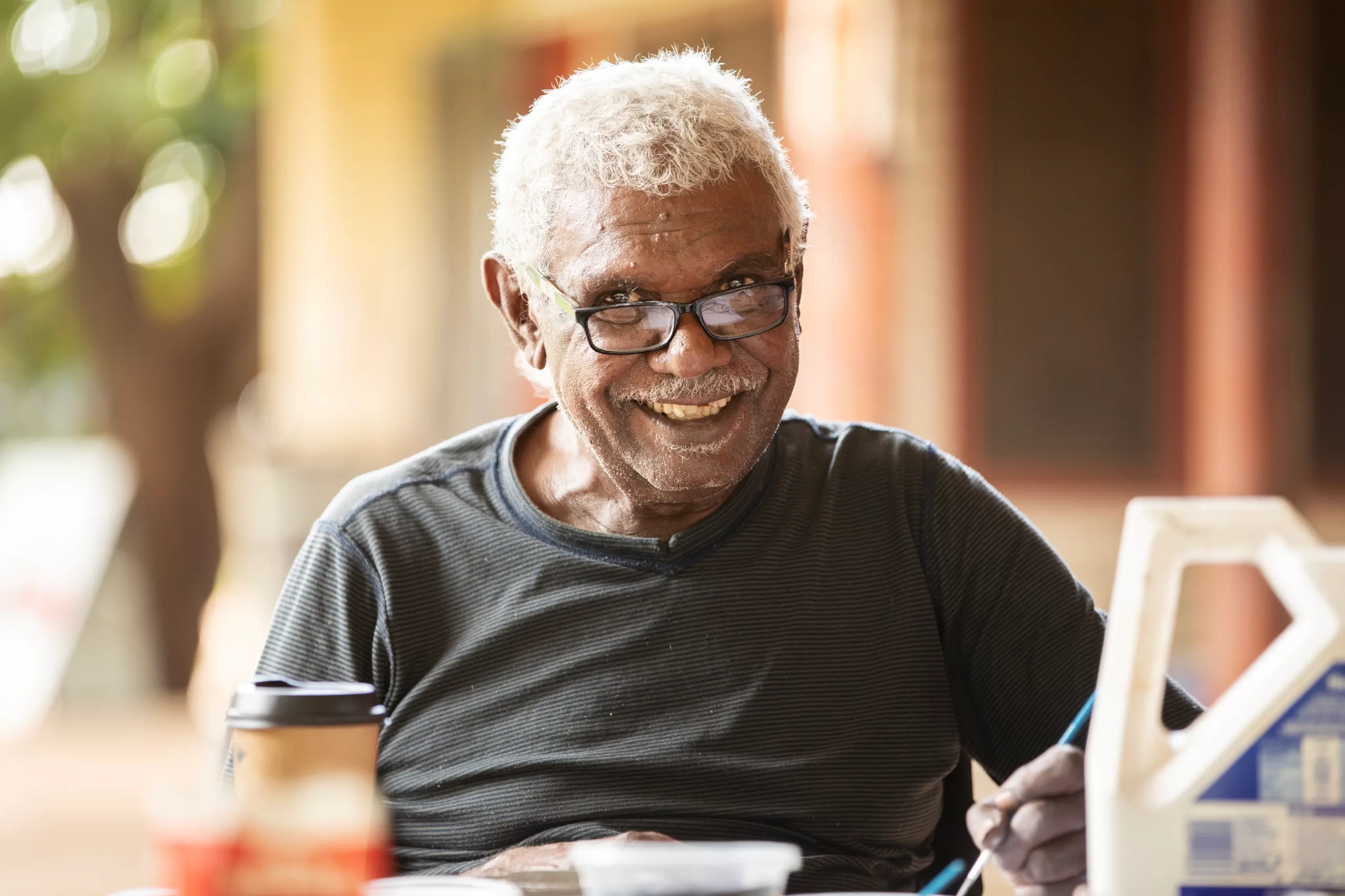
Nexus Airlines worked closely with Waringarri Art Centre senior artists and Miriwoong elders, Peggy Griffiths Madij and Ben Ward Galmirrl to create a unique design.
Ward’s design represents the many interconnecting life giving rivers, creeks and waterholes that are an essential link for people not only across the Kimberley, but throughout Western Australia with the underground streams creating life giving waterholes throughout much of the state.
Griffiths’ design portrays the body paint designs applied during dance and celebratory performance. Traditional performance brings her people together and connects families and communities.
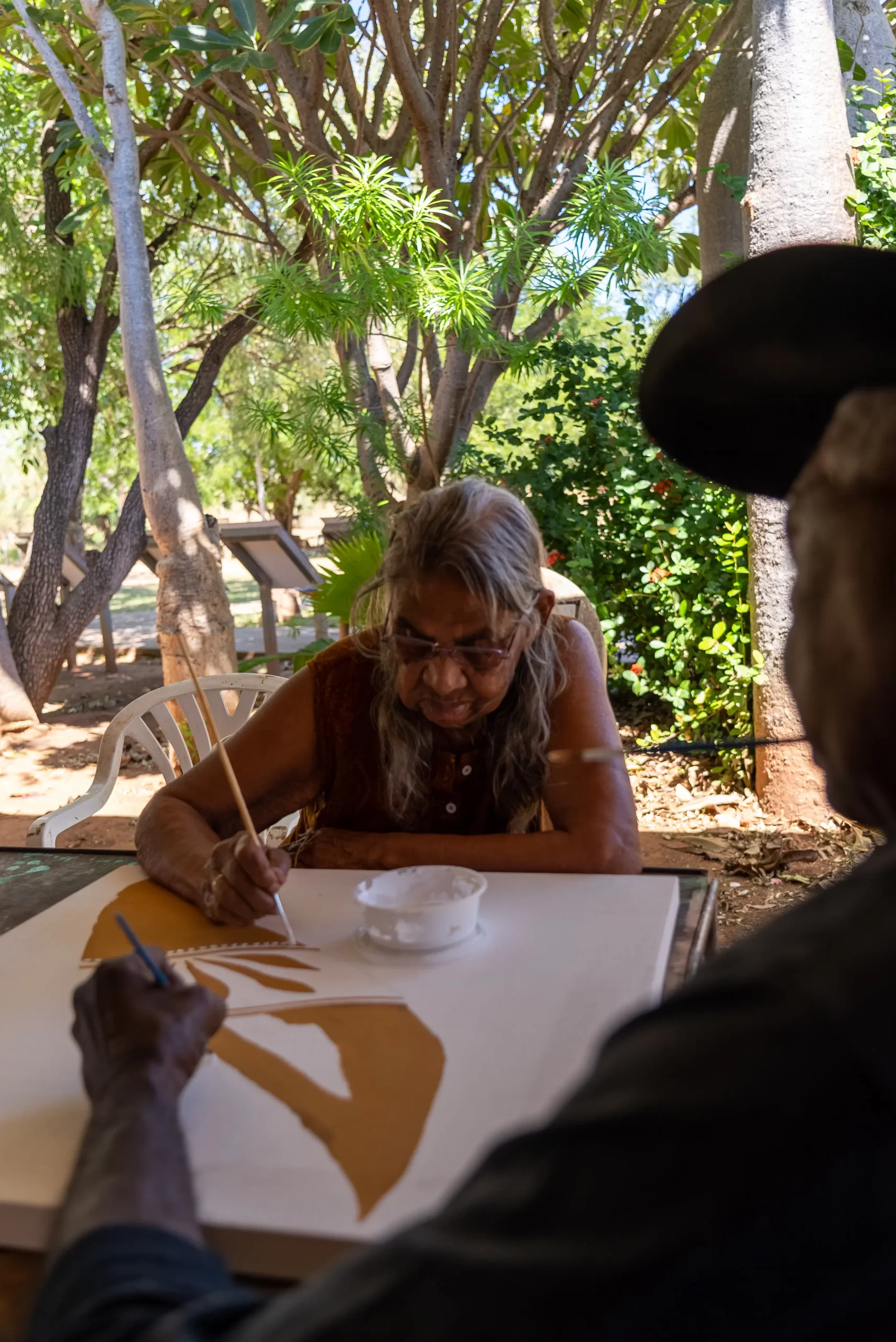
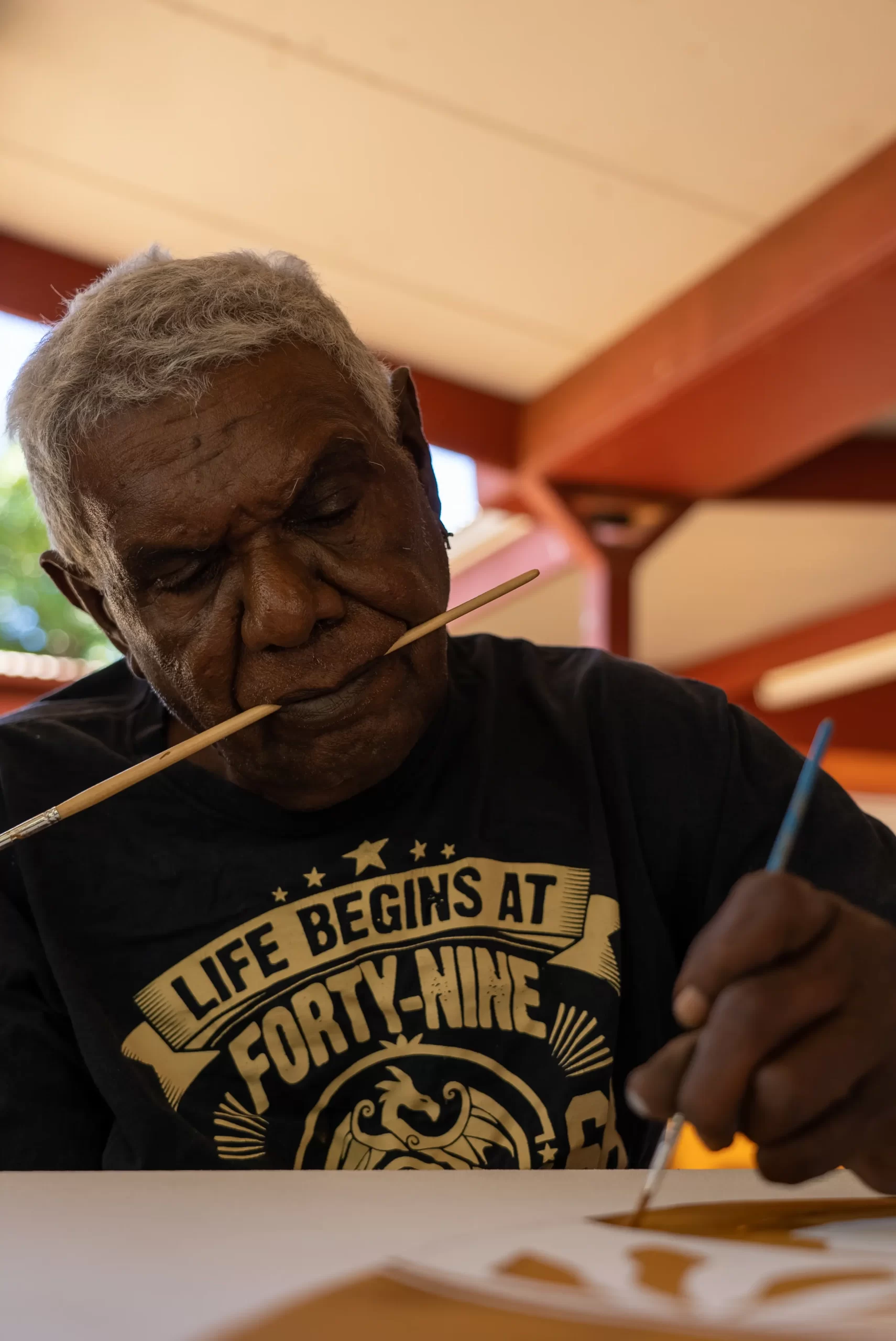
Her lines bordered by dotting signify the elegant movement of the dancer, in sync with the movement of Ward’s water-ways, connecting Country and people as one.
The colours used in the logo have been specifically selected to represent the diverse landscapes that make Western Australia so unique.
The ochre represents the majestic ranges and towering gorges of the Kimberley and Pilbara while the blue tones represent the coastline along the Mid-West and Perth.
Our hope is that the Nexus Airlines logo connects and celebrates the Country and people of regional Western Australia.
Explore Nexus
